Myself and an assigned group in a university class were tasked with researching a local business’s current brand and create ways to elevate their brand. We researched Chestnut Hill Bakery– a small-town bakery in Lynchburg, Virginia. We found their branding to be simple but inconsistent. In order to elevate their brand, we began a campaign by designing a new business card, website, and pastry packages. Finally, we developed a series of social media posts ideally made to create an Instagram page for the bakery. These posts can even be used as a template for other seasonal posts.
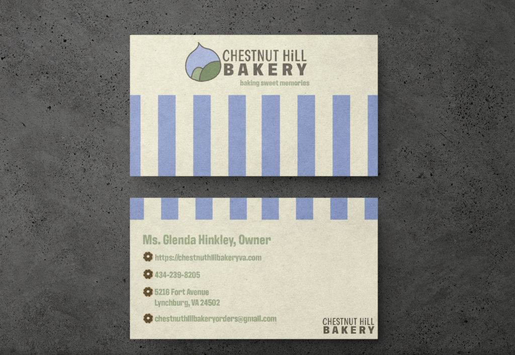
Business Card
We used the element of what we call “baker stripes” throughout our deliverables. The goal was to have repeating elements that tie everything together. Here, we see the branding very clearly: simple, nostalgic, and sweet.
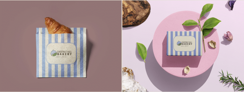
Packaging
Again, we have our “baker stripes” in our brand colors. The concept of these packages was to gain word-of-mouth advertisement for the bakery as well as build their identity.. We wanted people to see these boxes at parties and be able to identify them right away as belonging to Chestnut Hill Bakery.
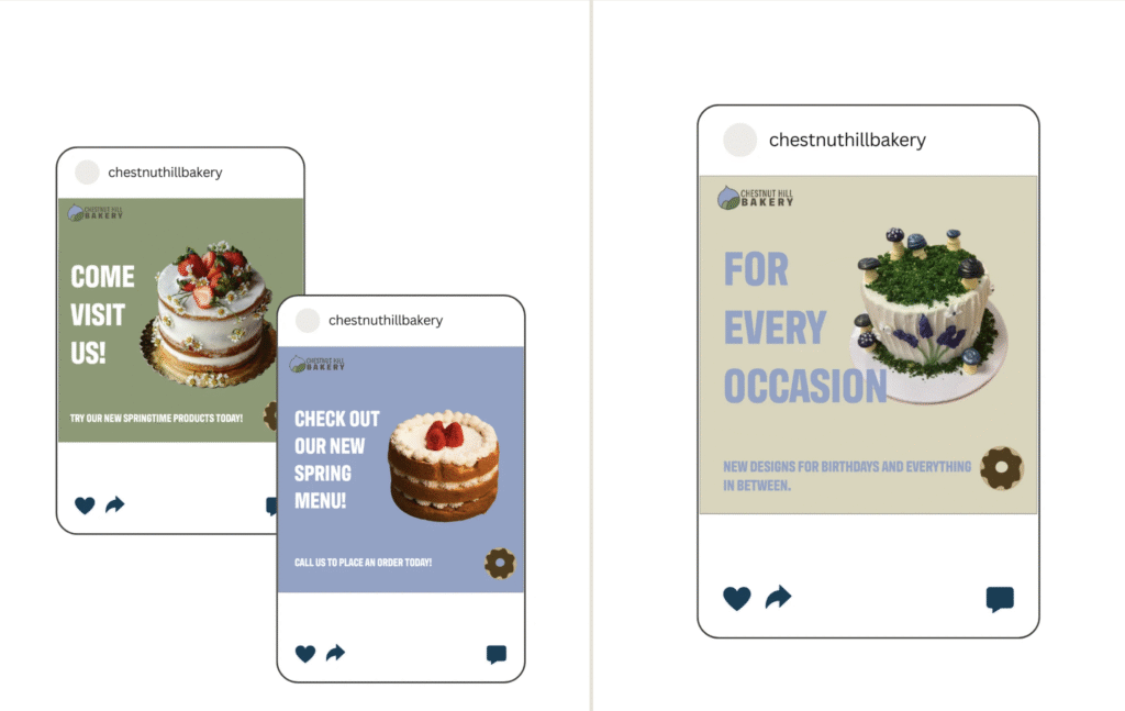
Social Media Series
This social media series was designed with the intent of starting up an Instagram account for Chestnut Hill Bakery. As of right now, they have an account but do not post on it at all. With this social media series, we hoped to reach a younger demographic–specifically the college-aged population in Lynchburg that do not know about the bakery.
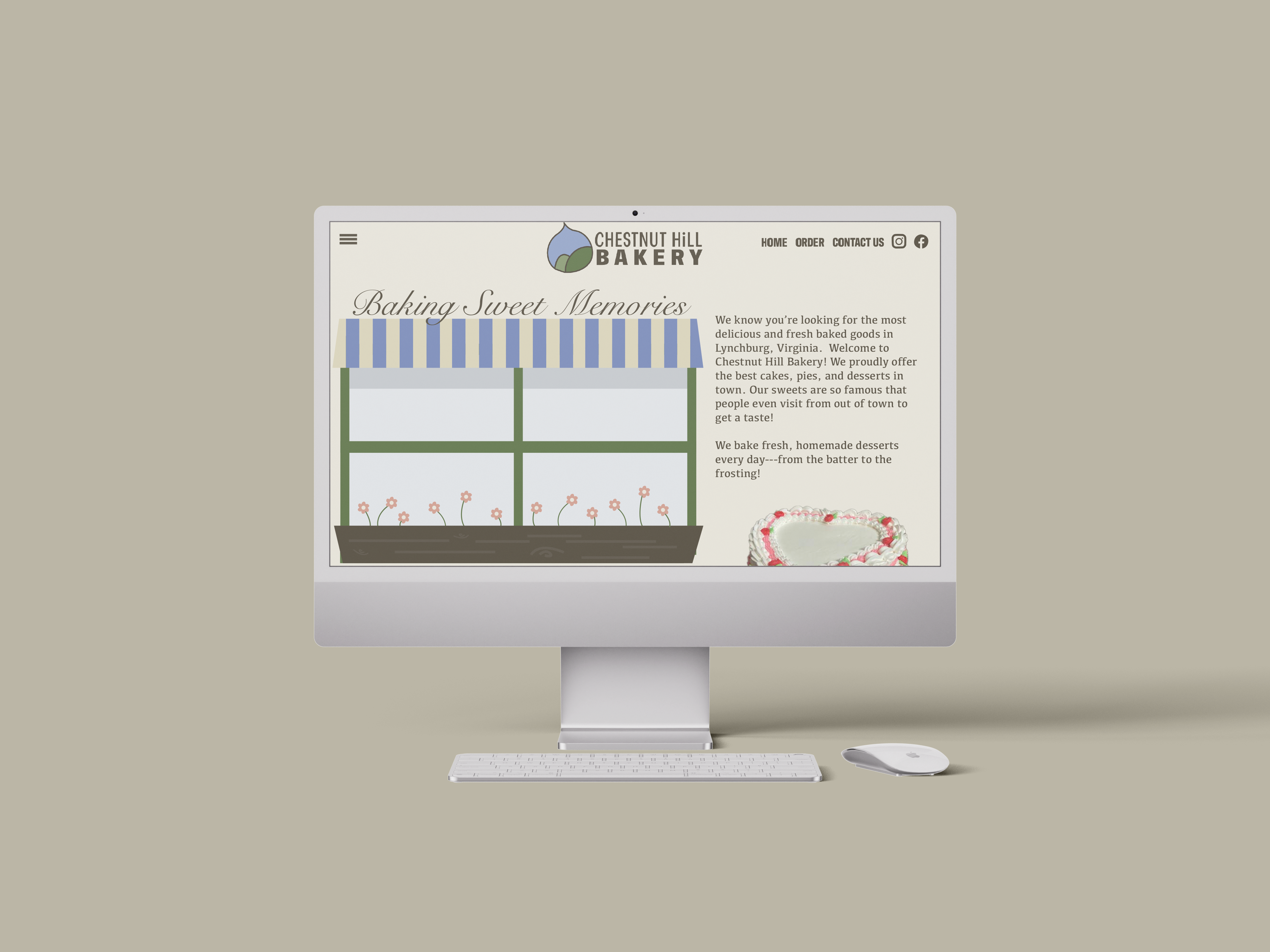
Website
We have inserted a mockup of the website. The goal again was to stick to our rebrand words: simple, nostalgic, and sweet. I believe that this website design does a great job at exemplifying that. We kept the elements from their current website and essentially just reorganized the information and redesigned their visuals.

Want to work with me?
Leave a Reply