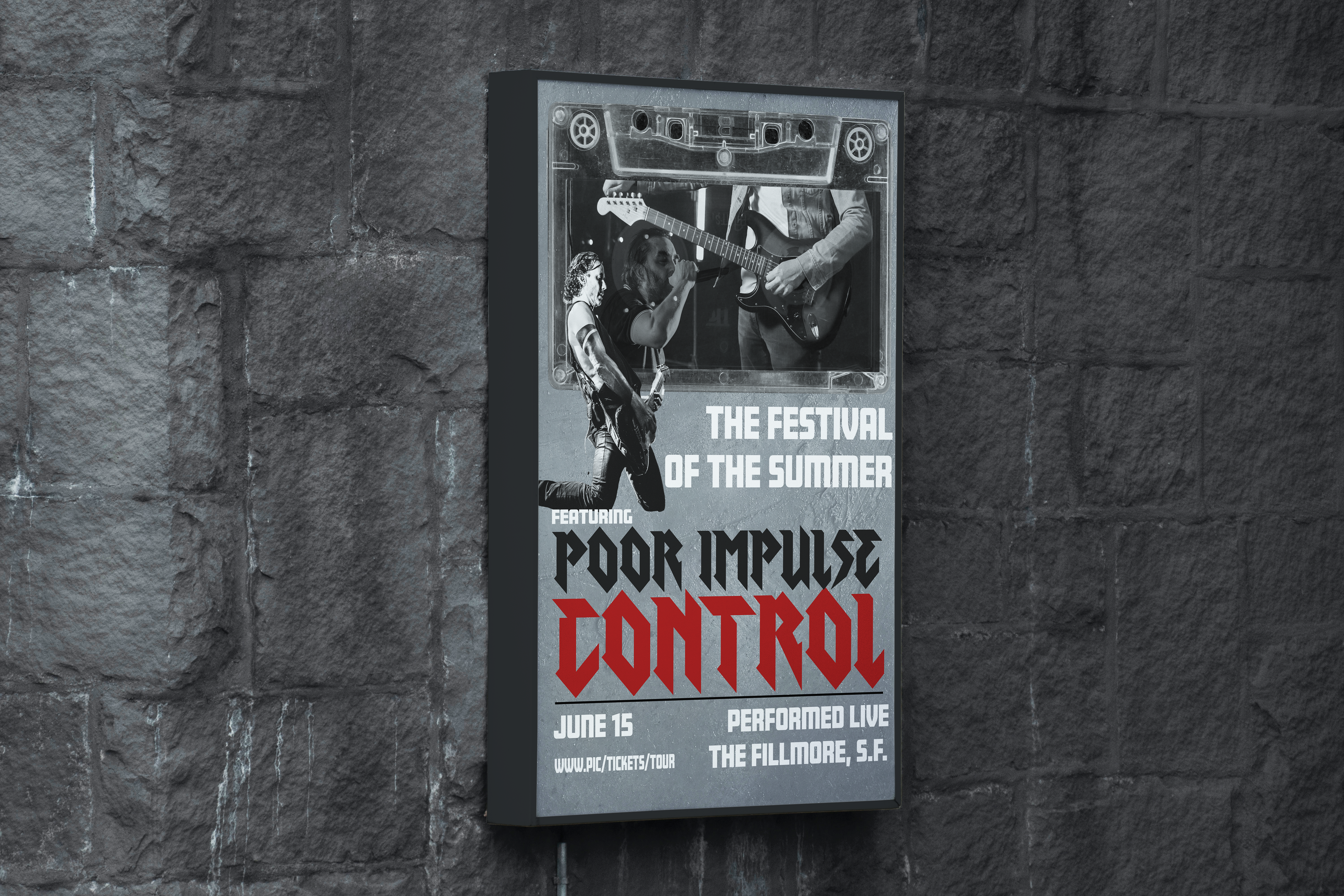
For this project, I created a poster advertisement for an event. I have been really into rock music recently, so I was inspired by my music taste to create a poster for a rock festival featuring a specific band.
I knew that I wanted to use red as my most contrasting color because I have seen many rock bands use red in their logos, giving them the aggressive and loud feel. It was kind of just a “go with the flow” moment, however, to make the rest of the poster greyscale. I feel that it was a good decision to make sure the images pieced together cohesively and made the red have a good contrast with the rest of the design.
I also brought the cassette tape to the top of the poster to tie in a relation to the three social media posts that go along with this project.
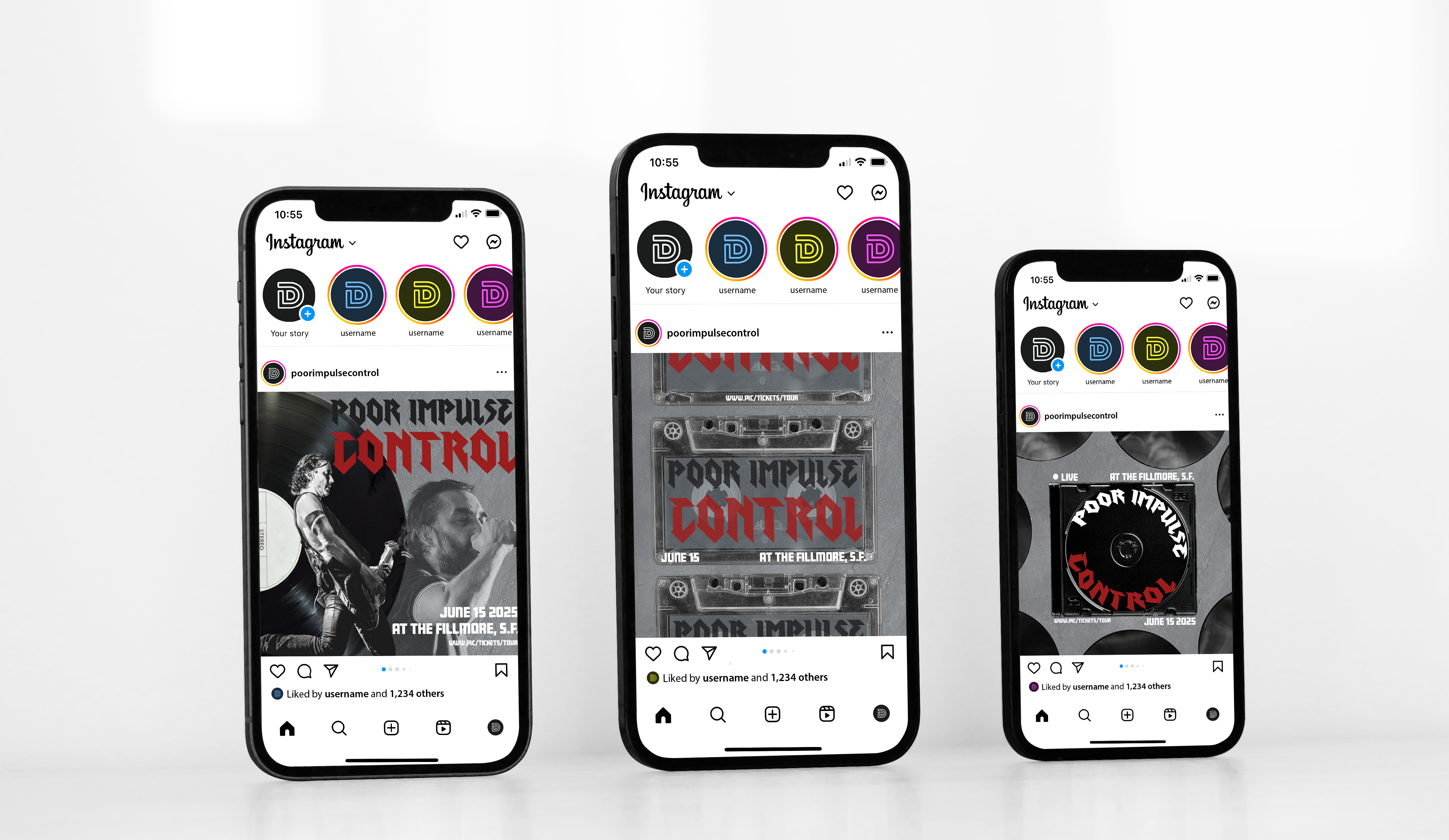
For the second half of my final project, I had to make three corresponding social media posts to go along with my event poster. The idea was to create posts that have a clear connection to the poster without recreating that design on a smaller scale.
I designed the posts to be able to stand alone, thus I needed to put all the necessary information on all three posts. I also created a theme with the posts by putting different physical elements to listen to music on the posts (record, cassette tape, and cd).
I also used pictures, fonts, and information used on the poster to further create a relationship between the poster and social media posts.
Want to work with me?
Leave a Reply